The digital environment is constantly changing. Design evolves and adapts to new needs and new users. However, some solutions do not go out of fashion. People from all generations know them and changing them could introduce chaos or at least frustration.
All of you know it very well and see it every day while typing on any of your devices. It helps you by indicating the spot for your future text and does follow new letters as you type. It also specifies the location in the text where you want to paste something that you previously copied. You might have seen it as an underscore or a block but usually, it takes the form of a blinking vertical line. As we found out while researching for this article - it also has a lot of names
- caret
- blinking cursor
- text cursor
- text insertion point
Where did the blinking cursor even come from?
In the last century, along with technological development, the possibility of creating and editing texts on the first computers appeared. However, writers struggled with the problem of the lack of a quick and intuitive possibility of changing or removing a selected fragment of the text.
Charles Kiesling was one of the engineers interested in advancing the capabilities of computers in the 1950s. He worked on improving the logic circuitry of computers such as the IBM 650. In 1967, Kiesling filed a patent for a new typing solution - a blinking cursor. However, this solution became widely known and used in 1977 with the premiere of Apple II and a year later with the premiere of the first commercially popular word processor WordStar.
Today, anyone who has had a computer in their hands at least once knows what a cursor means. Designers and developers working on products and adding new features can’t disregard solutions users are already used to.
So what should we do if we need to point two spots at once?
We’ve recently asked ourselves this question for the first time. We came across a case that made us think about it while designing a tool similar to code creator. The user was supposed to add a few elements in the line, which together created a whole code. Each of the elements could have been selected from a code completion list that also had a search function. First caret: the user needed to be able to see the location of a new element added in the "code". Second caret: if the user wanted to search for an element, the caret must have appeared in the active textfield.
What now? Should we delete one cursor? Gray it out? How about leaving both of them and ignoring the problem? We’ve decided to check some popular apps - desktop and mobile and find out how they solve this problem.
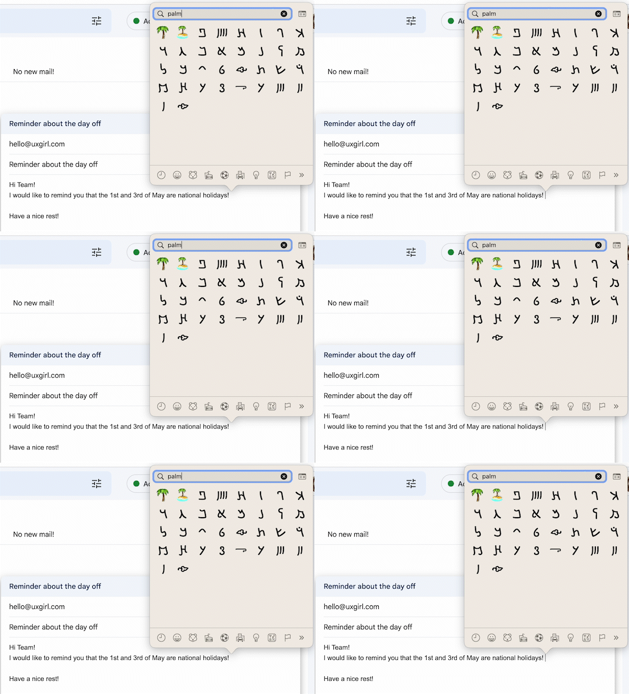
Gmail on Mac - Adding emoji to a new email
One caret follows the text entered in the search box. The other indicates the place in the email where the selected emoji will appear. It's worth noticing that they are both blinking and have the same color.

Google Docs - Searching an element in the doc
In that case, the first cursor follows the text typed in the finder tool. The second one points to the last active text location. Both of the cursors have the same color, but just the one in the finder is blinking. The second cursor starts to blink again after closing the finder.
.jpg)
iOS Notes - Adding emoji to the note
iPhone users can experience a double text cursor creating a new note on their phones. The cursors are very different from each other - they have different colors and only the one in the search box is blinking.

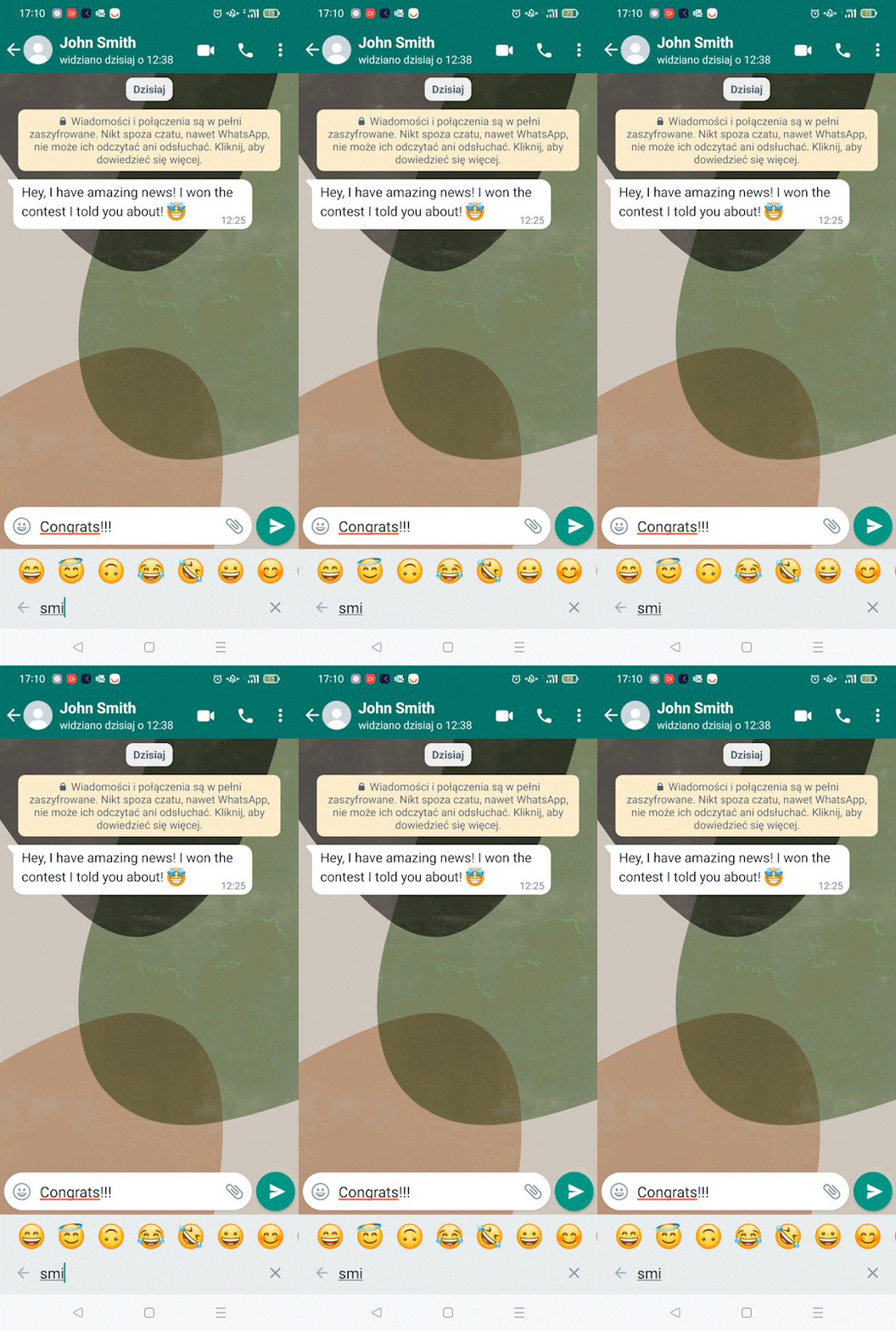
WhatsApp for Android - Adding emoji to the new message
In that case, we can see only one caret and it’s in a search box. The one in the textfield is invisible but the selected emoji appears in the place where a caret was active the last time.

Which one is the best?
After testing a few apps, it's time to summarize the pros and cons of each solution.
Visibility of both cursors at once
In our opinion, the user should always be able to see where the result of their action will appear. Making one of the carets invisible takes away some part of the user's control. So we stand for keeping both cursors visible to the user. What is important here is creating a hierarchy for them. So now let's take care of…
Colors
Let's pay attention to a good idea that appeared in one of the inspirations we found: the cursor that is not responsible for the main action on the screen is grayed out. To highlight the importance of the main cursor, we can also choose colors other than black. Blue for example will call attention to the active status of the textfield.
Blinking
Last but not least - blinking of the cursor. It is obvious that this function helps a lot in finding our current location in the text. But aren't two elements blinking on the screen too much? In our opinion, yes. In the case of a double cursor, we would definitely choose to animate only one of them, the main action one.
Conclusions
Adding a blinking cursor to the interfaces was undoubtedly necessary to facilitate many people's daily work. This invention has stood the test of time and is still widely used today. However, sometimes even the most reliable solutions need an adaptation to more complex features. Yet, as designers, we have to remember that if the user already knows the action of a component, we shouldn’t change it.
In our opinion, in this task, we should focus on designing the hierarchy of elements. We have the ability to work on the visibility, color, and movement of elements. This essential UX designer skill will keep the interface transparent and let the user stay in control.
And you? How would you design a tool that requires two cursors? And as a user, have you noticed this problem in the apps you use?


.svg)

.jpg)


